


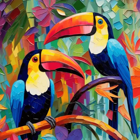


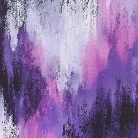


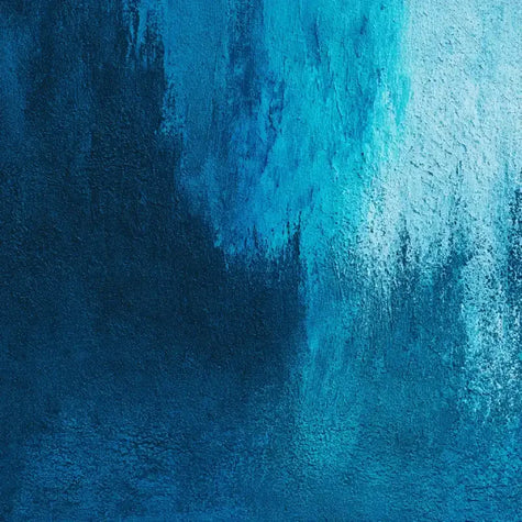


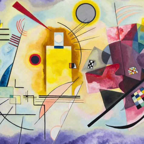


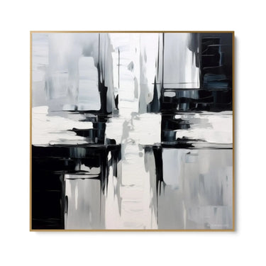
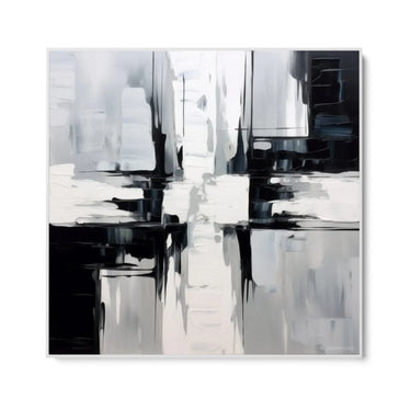

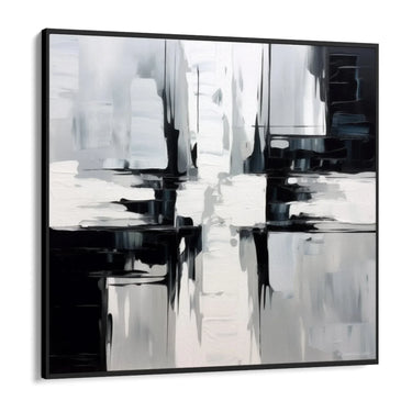

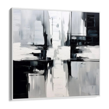
Opposite colors

Pochi pezzi disponibili.

Garanzia reso e rimborso 14 giorni
Description
Description of the Framework
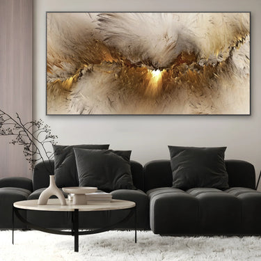
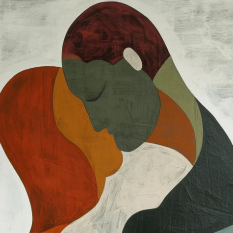
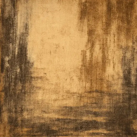
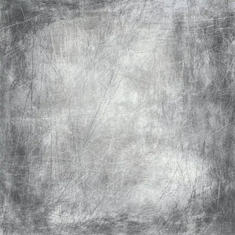
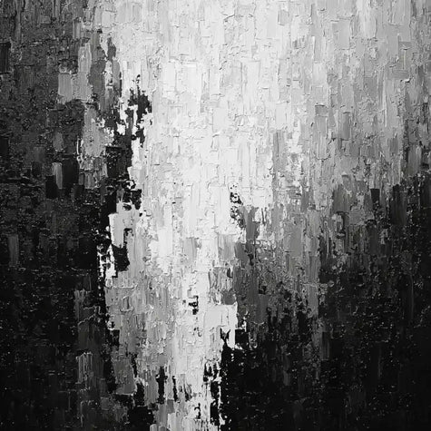
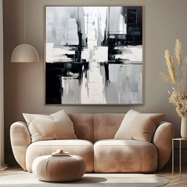
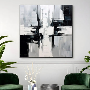
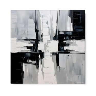
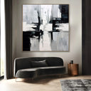
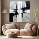
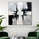
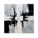
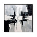
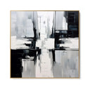
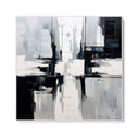
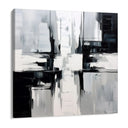
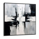
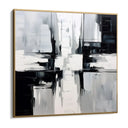
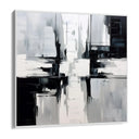
"Opposite Colors" is a canvas print that captures attention with its abstract and modern design. The painting presents a composition of intersecting lines and shapes, creating a dynamic and intriguing visual effect.
Representation
The painting represents a play of contrasts between light and dark, with a predominance of black and white tones. The vertical and horizontal lines overlap, suggesting a sort of cross or intersection, which can be interpreted as a symbol of balance and connection.
Colors Used
The main colors used in "Opposite Colors" are white, black and various shades of grey. These neutral colors create an elegant and sophisticated atmosphere, perfect for any modern environment. The combination of these tones gives depth and dimension to the painting, making it a centerpiece in any room.
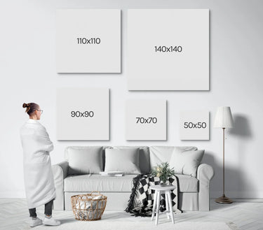
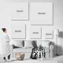
Specifications
Your art, your expression.
Every wall tells who you are. Our works transform your spaces into emotions, because your home deserves to reflect who you really are.
How your art is born


Are the colors of the prints faithful to the images shown online?
Yes, our high-definition printing technologies ensure precise and vivid color rendering.
However, tones may vary slightly depending on the device screen.
Can I see how a canvas print will look in my space before purchasing it?
Yes, our site offers a completely free wall projection service click here.
This helps you imagine how each print will complete your environment before making the purchase, ensuring that your choice fits perfectly with your space and style.
Does the canvas come already mounted and ready to hang?
Yes! The print is already stretched by hand on a frame and ready to be hung. No additional assembly is required.
Can I customize the sizes?
Yes, you can customize the sizes, just write to us on WhatsApp or send us an email: our team will guide you in choosing the format and preparing the file to achieve the best possible result.
What happens if the print arrives damaged or is not as I expected?
In case of damage or defect, we ask you to contact us within a few days of arrival with a photo of the product. We will quickly send you a free replacement or we will find the best solution together.
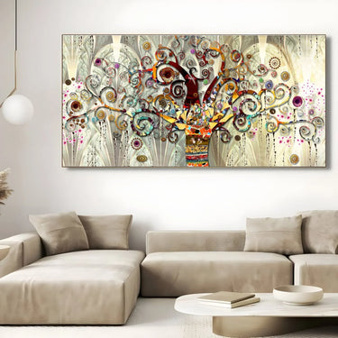
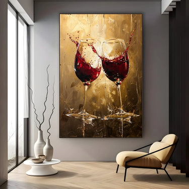
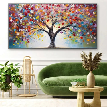
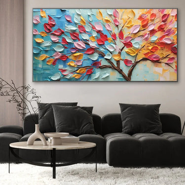
Recently viewed:
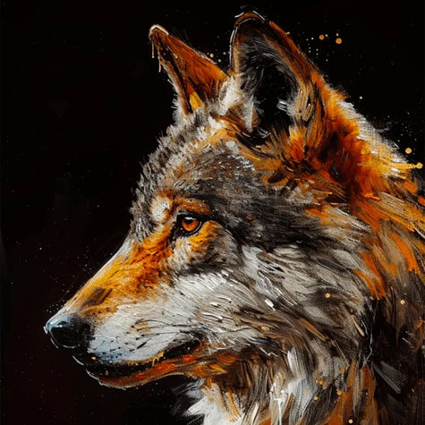
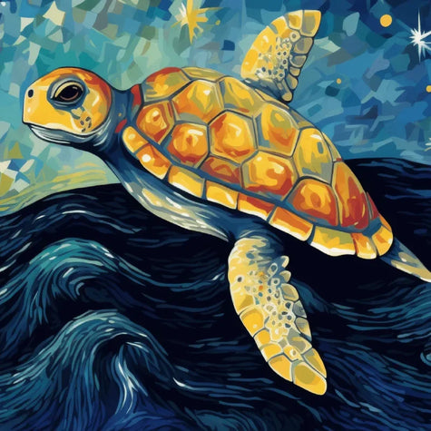
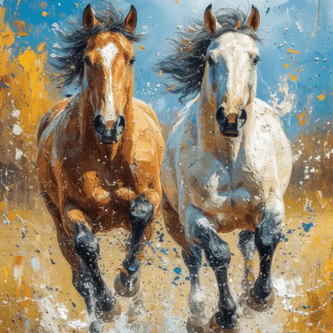
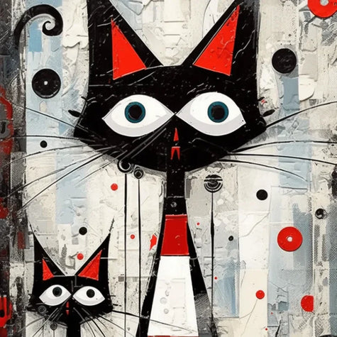
Best Sellers: