Canvas Prints, Famous Works in Red
Works in red capture the essence of passion, vitality, and pure energy. It is the color of heartbeat and movement, capable of lighting up a space with its magnetic force. Every red canvas becomes an act of courage, an invitation to experience emotion directly and without filters. It is a color that speaks to the heart even before the eye, transforming every environment into an intense and profound sensory experience.
The Best Spaces for Red Prints
Choosing a red print means bringing a vibrant presence into your home, capable of infusing warmth and character. Each shade tells a different emotion: carmine red is deep and enveloping, vermilion red expresses energy and brightness, while burgundy conveys elegance and refinement.
In a living area or dining room, red stimulates conviviality and conversation. In a creative studio, it sparks motivation and fosters inspiration. In the bedroom, when balanced, it evokes intimacy and passion. It is a dynamic and powerful color, yet always able to adapt with moderation to the context.
Long loved by artists for its emotional intensity, red spans centuries: from Titian to Rothko, from Kandinsky to Pollock, it symbolizes creative vitality and expressive freedom. It is the color that tells of action, transformation, and the power of imagination.
- How can red transform the perception of a living space?
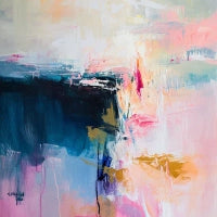
Red is a color that ignites the space and makes it alive. In the works of the Abstract Art collection, it becomes pure movement, a visual pulse that fills the canvas and captures the eye. Every red shape and brushstroke is an emotional vibration that changes the perception of the environment, generating energy, intensity, and engagement. Placed in an interior, red does not just decorate: it transforms, bringing warmth, power, and a sense of artistic vitality.
How to Choose the Right Red Print for Your Space
Every red canvas print is a gesture of personality and determination. To enhance its presence and maintain visual balance, here are some tips:
-
Complementary colors: red finds harmony alongside green in its softer shades, such as sage or olive. These accents soften the color intensity and make the space harmonious and sophisticated.
-
Opposite colors: paired with anthracite gray, pure white, or deep black, red becomes the absolute protagonist. Neutral tones highlight it, creating an elegant and modern contrast.
-
Light: with natural light, red releases its vibrant energy; with warm artificial light, it softens, expressing intimacy and depth. Direct light enhances its most fiery shades.
-
Furniture: with dark wood furniture, red communicates prestige and intensity; with light and linear furnishings, it takes on a contemporary and bold tone. In modern compositions, it becomes the beating heart of the space.
-
Floors: on natural parquet or neutral surfaces like concrete or resin, red expresses modernity and dramatic impact. On marble or glossy surfaces, it assumes a classic and timeless elegance.