
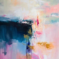
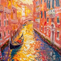

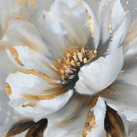
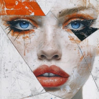
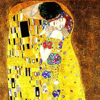


Prints on Canvas Grigie
Discover the balance and sobriety of the color gray printed on canvas. Elegant and versatile designs, inspired by the calm of neutral tones and essential beauty.


 Up to 26% offSale priceFrom €74,90 Regular price €99,90Unit price


 Up to 26% offSale priceFrom €74,90 Regular price €99,90Unit price


 Up to 26% offSale priceFrom €74,90 Regular price €99,90Unit price


 Up to 26% offSale priceFrom €74,90 Regular price €99,90Unit price


 Up to 26% offSale priceFrom €74,90 Regular price €99,90Unit price


 Up to 26% offSale priceFrom €74,90 Regular price €99,90Unit price


 Up to 26% offSale priceFrom €74,90 Regular price €99,90Unit price


 Up to 26% offSale priceFrom €74,90 Regular price €99,90Unit price


 Up to 26% offSale priceFrom €74,90 Regular price €99,90Unit price


 Up to 26% offSale priceFrom €74,90 Regular price €99,90Unit price


 Up to 26% offSale priceFrom €74,90 Regular price €99,90Unit price


 Up to 26% offSale priceFrom €74,90 Regular price €99,90Unit price


 Up to 26% offSale priceFrom €69,90 Regular price €94,90Unit price


 Up to 26% offSale priceFrom €69,90 Regular price €94,90Unit price


 Up to 26% offSale priceFrom €69,90 Regular price €94,90Unit price


 Up to 26% offSale priceFrom €69,90 Regular price €94,90Unit price


 Up to 26% offSale priceFrom €69,90 Regular price €94,90Unit price


