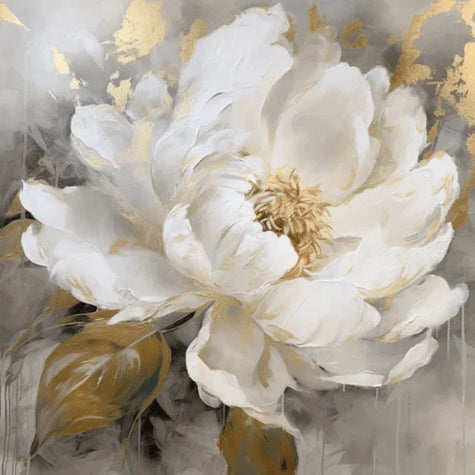
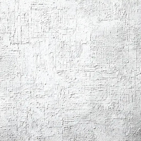
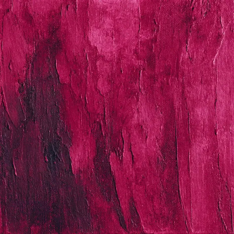
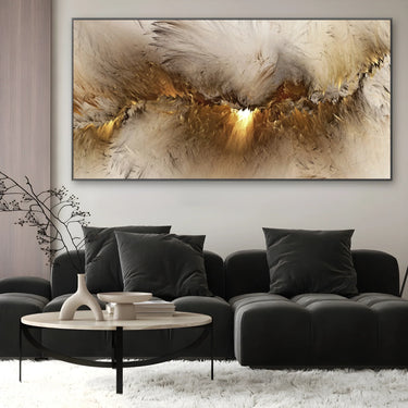
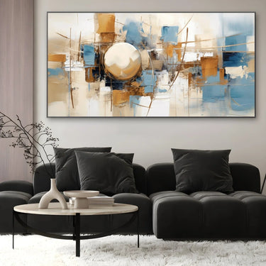
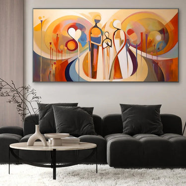
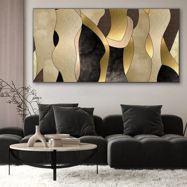
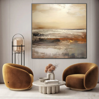
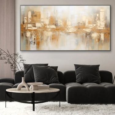
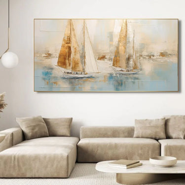
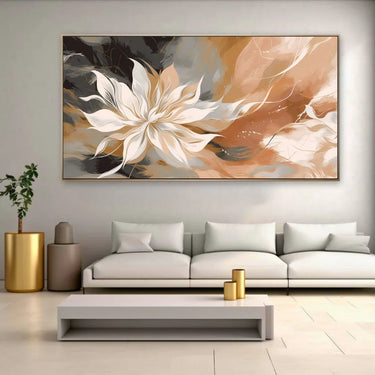
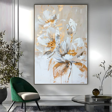
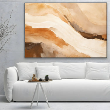
The works in cream tell of harmony, delicacy and natural light. It is the color of serenity and balance, capable of enveloping the gaze with its discreet elegance. Every cream canvas transmits a sensation of visual peace and refinement, transforming the space into a bright and warm environment. It is a shade that speaks of silent beauty, the one that manifests itself in simplicity and detail.
The most suitable environments for cream-colored prints
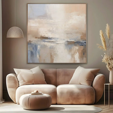
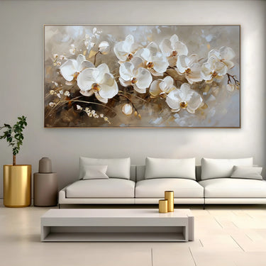
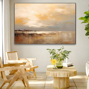
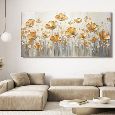
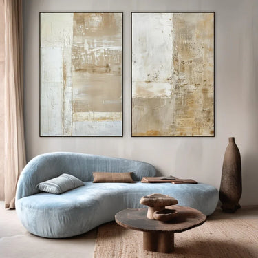
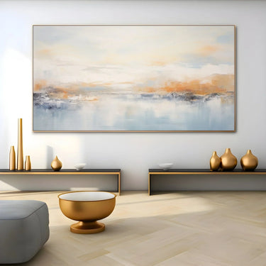
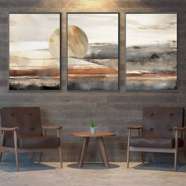
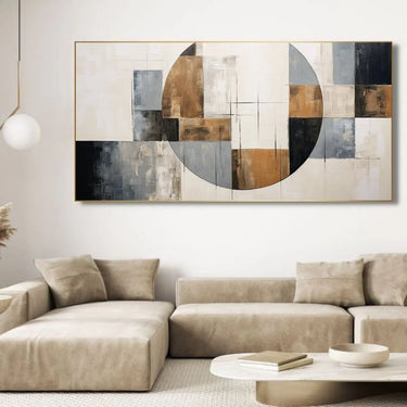
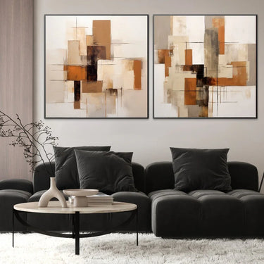
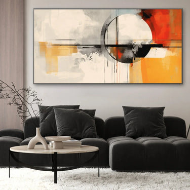
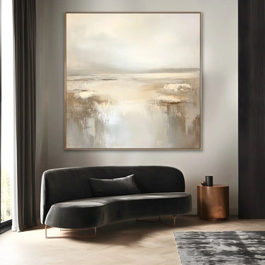
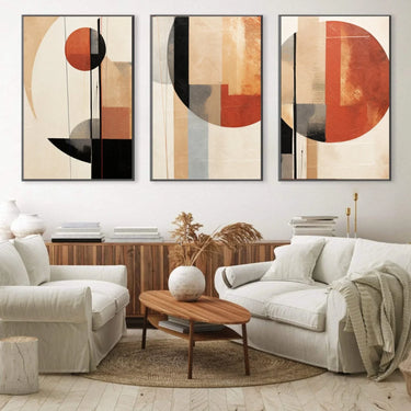
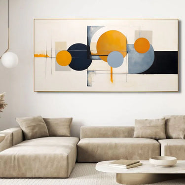
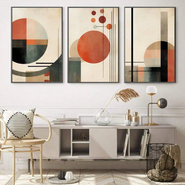
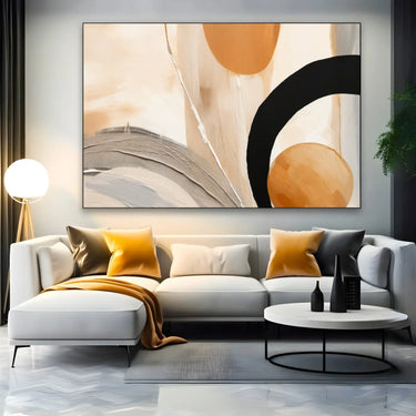
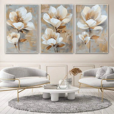
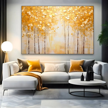
Choosing a cream print means opting for a sober and sophisticated language. Its shades, ranging from warm white to ivory to very light beige, spread a gentle and constant light. It is a color that naturally adapts to every environment and style.
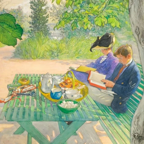
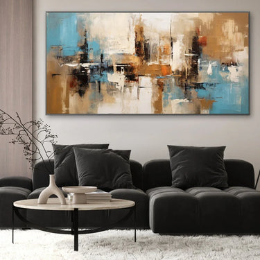
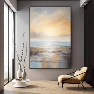
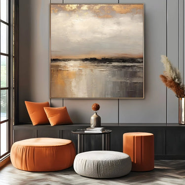
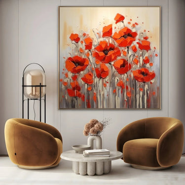
In a bedroom it promotes rest and tranquility, in a living room it gives a sense of order and visual comfort, in a study it inspires clarity and mental harmony. Cream-colored prints integrate perfectly with wooden furniture, natural fabrics and neutral tones, creating atmospheres of balance and light.
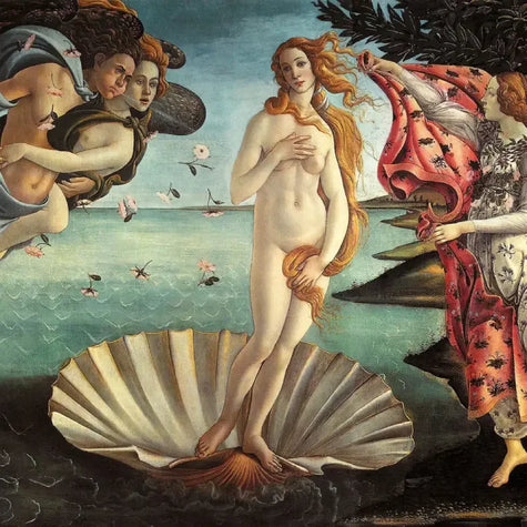
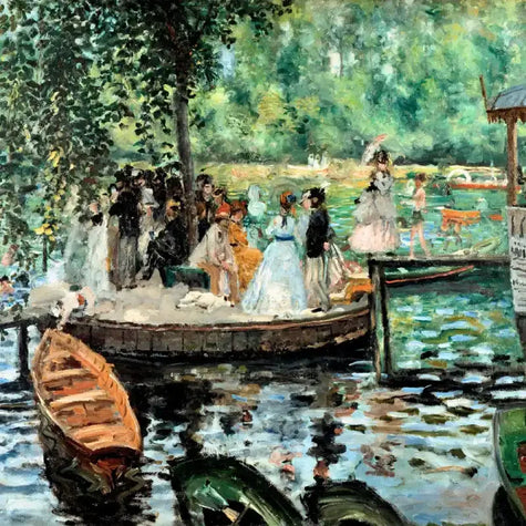
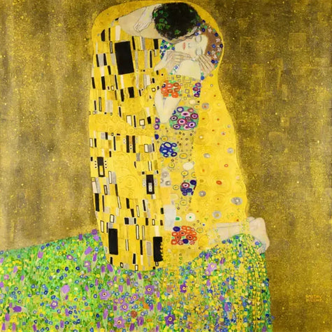
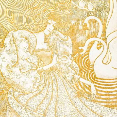
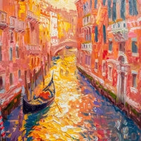
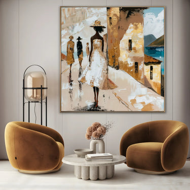
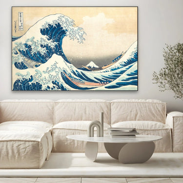
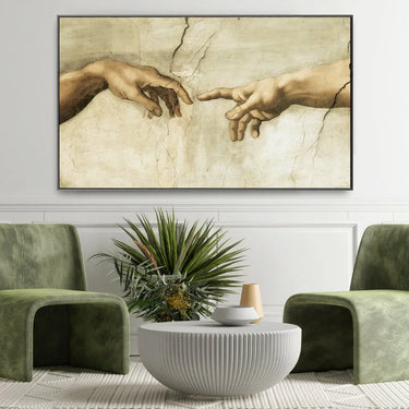
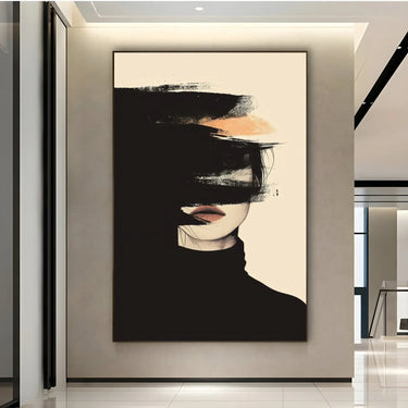
From Vermeer to Degas, up to contemporary masters, the warm light of cream has been used to tell of the intimacy and purity of the human figure.
How can cream transform the perception of a lived-in space?
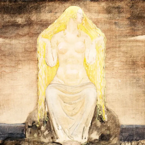
The cream color transforms the space making it more harmonious and deep. In the Figurative Art collection it becomes the tone of inner light, a color that accompanies the gesture and the figure without dominating them. Its presence makes the subject more soft, more human, more authentic. Inserted in an environment, cream spreads serenity and visual coherence, creating an atmosphere that invites silent contemplation and emotional intimacy.
How to choose the right cream-colored print for your environment
Every cream-colored print is a breath of balance. To enhance it with elegance, consider these elements:
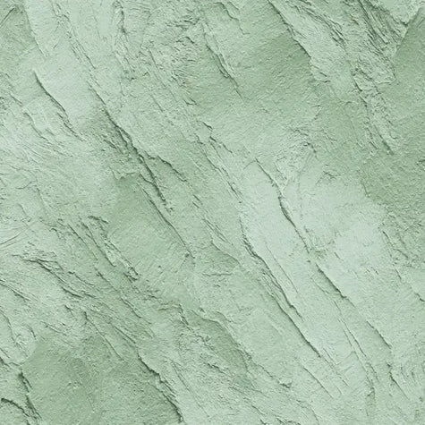
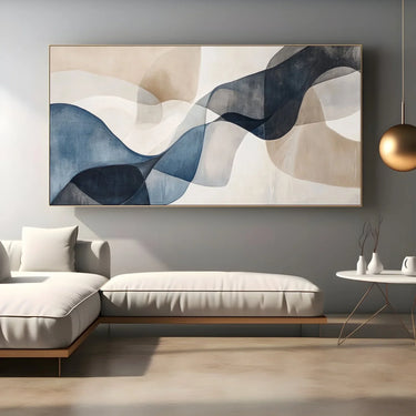
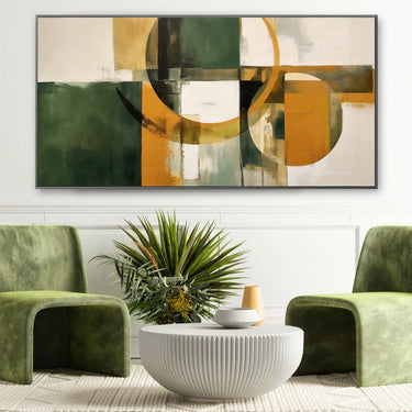
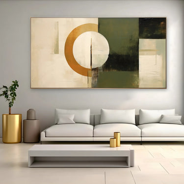
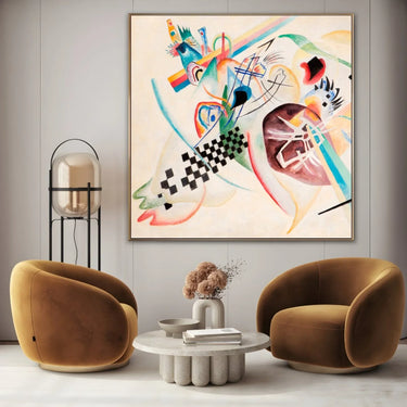
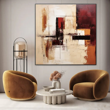
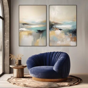
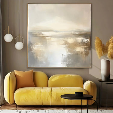
Complementary colors:warm and natural tones like sand, light wood and sage green create a soft and harmonious dialogue.
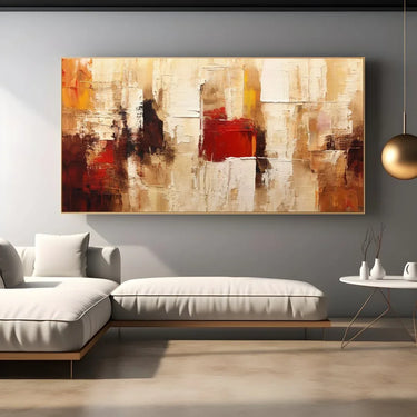
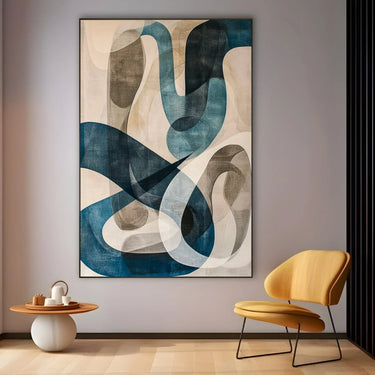
Opposite colors:anthracite gray, deep blue and matte black enhance the brightness of cream with a refined contrast.
Light: with natural light cream reflects brilliance and openness, while with warm artificial light it becomes more intimate and welcoming.
Furniture: it pairs perfectly with materials such as linen, cotton, natural wood and details in brass or glass. In modern environments it gives balance and lightness.
Floors: on light parquet or stone the color integrates naturally, on dark surfaces it creates an elegant and measured contrast.