Canvas Prints, Famous Works in Petrol Blue
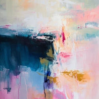
Works in petrol blue capture the depth of the sea and the refinement of the night. It is a color that combines mystery and elegance, capable of captivating the eye with its discreet intensity. Each petrol blue canvas becomes a weave of emotions: it vibrates with sophistication while retaining an intimate and sensual soul. It is the shade of emotional depth, magnetic charm, and strong personality.
The Best Spaces for Petrol Blue Prints
Choosing a petrol blue print means choosing class without giving up modernity. It is a color that envelops the space with character and harmony, offering a silent yet unmistakable elegance. Every shade, between blue and green, tells a different balance: deep blue expresses serenity and introspection, while lighter petrol notes evoke freshness and brightness.
In a bedroom, it creates an atmosphere of sophisticated relaxation; in a modern living room, it adds style and personality; while in a study, it inspires focus and depth of thought. It is perfect for those who want a space that combines contemporary charm and aesthetic harmony.
In the world of art and fashion, petrol blue is the color of discreet luxury. From Yves Klein to the stylistic visions of Chanel and Dior, it has been chosen to express identity, elegance, and charisma. It is a shade that does not follow trends but inspires them.
- How can petrol blue transform the perception of a living space?
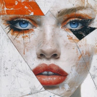
Petrol blue has a shifting depth that changes with light and environment. In the Fashion & Beauty collection, it becomes a symbol of style and personal charm. In works dedicated to the body, face, and feminine elegance, petrol blue becomes visual skin, a material that caresses the eye and tells of harmony and power. Placed in a space, it amplifies the perception of depth and intimacy, creating a sophisticated and enveloping atmosphere.
How to Choose the Right Petrol Blue Print for Your Space
Each petrol blue print is a dialogue between elegance and introspection. To enhance its presence and achieve a balanced, contemporary effect, consider these elements:
-
Complementary colors: petrol blue finds its balance alongside copper or antique pink. These accents warm the composition, creating refined contrasts and a sense of discreet luxury.
-
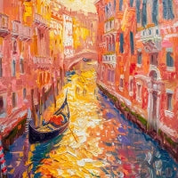
Opposite colors: warm tones like terracotta, light gold, and cream enhance the depth of petrol blue, providing visual balance and color richness.
-
Light: with natural light, petrol blue reveals its green soul; with warm artificial light, it becomes more velvety and intimate. It is a color that changes mood with lighting, making every hour of the day a different experience.
-
Furniture: paired with dark woods or golden metals, it communicates contemporary elegance; with light woods and natural fabrics, it takes on a more relaxed and harmonious tone. Perfect with velvet elements, glass, or matte surfaces.
-
Floors: on light parquet, petrol blue stands out with brightness; on dark or concrete surfaces, it becomes enveloping and deep. In modern spaces, it creates a metropolitan and chic effect.







 Up to 26% offSale priceFrom €74,90 Regular price €99,90Unit price


 Up to 26% offSale priceFrom €74,90 Regular price €99,90Unit price


 Up to 26% offSale priceFrom €74,90 Regular price €99,90Unit price


 Up to 26% offSale priceFrom €104,90 Regular price €139,90Unit price


 Up to 26% offSale priceFrom €74,90 Regular price €99,90Unit price


 Up to 26% offSale priceFrom €69,90 Regular price €94,90Unit price


 Up to 25% offSale priceFrom €94,90 Regular price €119,90Unit price


 Up to 26% offSale priceFrom €74,90 Regular price €99,90Unit price


 Up to 26% offSale priceFrom €69,90 Regular price €94,90Unit price


