Canvas Prints, Famous Works in Orange
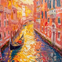
Works in orange convey energy, creativity, and vitality. It is the color of movement and warm light, capable of transmitting enthusiasm and positivity. Every orange canvas radiates visual warmth and becomes a center of natural attention. It is a tone that embraces and lights up the space, combining the strength of red with the brightness of yellow in a harmonious vibration that invites expression and joy.
The best environments for orange prints
Choosing an orange print means introducing vital energy and optimism into the environment. Lighter shades, such as peach or apricot, bring softness and brightness; more intense ones, like copper or coral, create character and depth.
In a living room, orange encourages conviviality and openness; in a bedroom, it conveys warmth and comfort; in a studio, it stimulates concentration and creativity. It is perfect for modern, industrial, or boho spaces, where the color becomes the protagonist and interacts with natural materials like wood and stone.
From Kandinsky to Mark Rothko, orange has been used to express spiritual energy and inner vibration, symbolizing art that becomes light and movement.
- How can orange transform the perception of a living space?
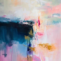
Orange changes the perception of space, making it more warm and stimulating. In the Abstract Art collection, it becomes a visual force that shapes forms and surfaces with dynamic balance. Abstract compositions in orange create rhythm and depth, transforming walls into surfaces of energy and warmth. Placed in the environment, they generate a positive vibration that invites thought and movement.
How to choose the right orange print for your space
Every orange print is a balance between light and matter. To best enhance it, consider these elements:
-
Complementary colors: blue and powder blue create a natural and refined contrast that highlights the brightness of orange.
-
Opposite colors: neutral tones like light gray, beige, and warm white soften the color’s intensity while maintaining balance and visual harmony.
-
Light: natural light enhances the tone’s brilliance, while warm artificial light makes it softer and more enveloping. Grazing lighting highlights textures and color variations.
-
Furniture: perfect with light woods, rattan, or golden metals. In minimalist interiors, it becomes a chromatic accent of personality.
-
Floors: on cement or resin surfaces, it appears modern and bold; on natural parquet, it creates a warm and welcoming effect.


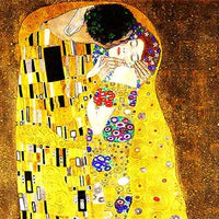




 Up to 26% offSale priceFrom €84,90 Regular price €114,90Unit price


 Up to 26% offSale priceFrom €84,90 Regular price €114,90Unit price


 Up to 26% offSale priceFrom €84,90 Regular price €114,90Unit price


 Up to 26% offSale priceFrom €84,90 Regular price €114,90Unit price


 Up to 26% offSale priceFrom €84,90 Regular price €114,90Unit price


 Up to 26% offSale priceFrom €74,90 Regular price €99,90Unit price


 Up to 26% offSale priceFrom €74,90 Regular price €99,90Unit price


 Up to 26% offSale priceFrom €74,90 Regular price €99,90Unit price


 Up to 26% offSale priceFrom €69,90 Regular price €94,90Unit price


 Up to 26% offSale priceFrom €69,90 Regular price €94,90Unit price


